

Posters in 2021 - KING TONY Tools
To showcase the product's look and information more prominently, the design style of the 2021 poster has taken a simpler turn compared to 2020.
Especially notable is the shift away from intricate grid elements in the background that could clutter the visuals.
The color palette has also been simplified, keeping the overall scene focused on the essential information for improved readability convenience.
為了能夠更凸顯產品的樣貌及文字資訊,2021年海報的設計風格相較於2020年變得簡約,尤其是背景的元素不再是容易使畫面複雜化的網格,色彩的使用方面也更單純,整體的畫面只保留最重要的資訊以提升閱讀的便利性。

To emphasize the product's sleek and simple design, I placed it right at the center of the poster.
I used a gentle shade of blue to create a separation in the background, with product information and features distributed around the product's outer space.
However, looking back at this poster now, I feel there's room for some adjustments.
為了凸顯此產品單純且流線的外型,我將產品至於畫面中心,並使用溫和的藍色將背景分割開來,而產品資訊及特色則分佈在產品外圍的空間。不過現在重新 檢視這張海報反而覺得能夠調整不少地方。
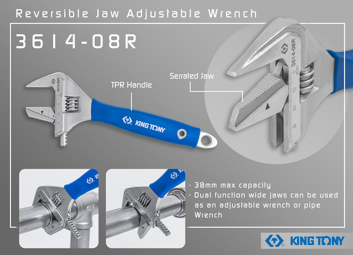
Actually, the design of this one is a bit plain. It looks like a poster that just slapped on the necessary content, and the borderlines are kinda optional.
其實這張的設計稍嫌普通,看起來只是一張把該有的內容放上去的海報而已,外框線也是可有可無。
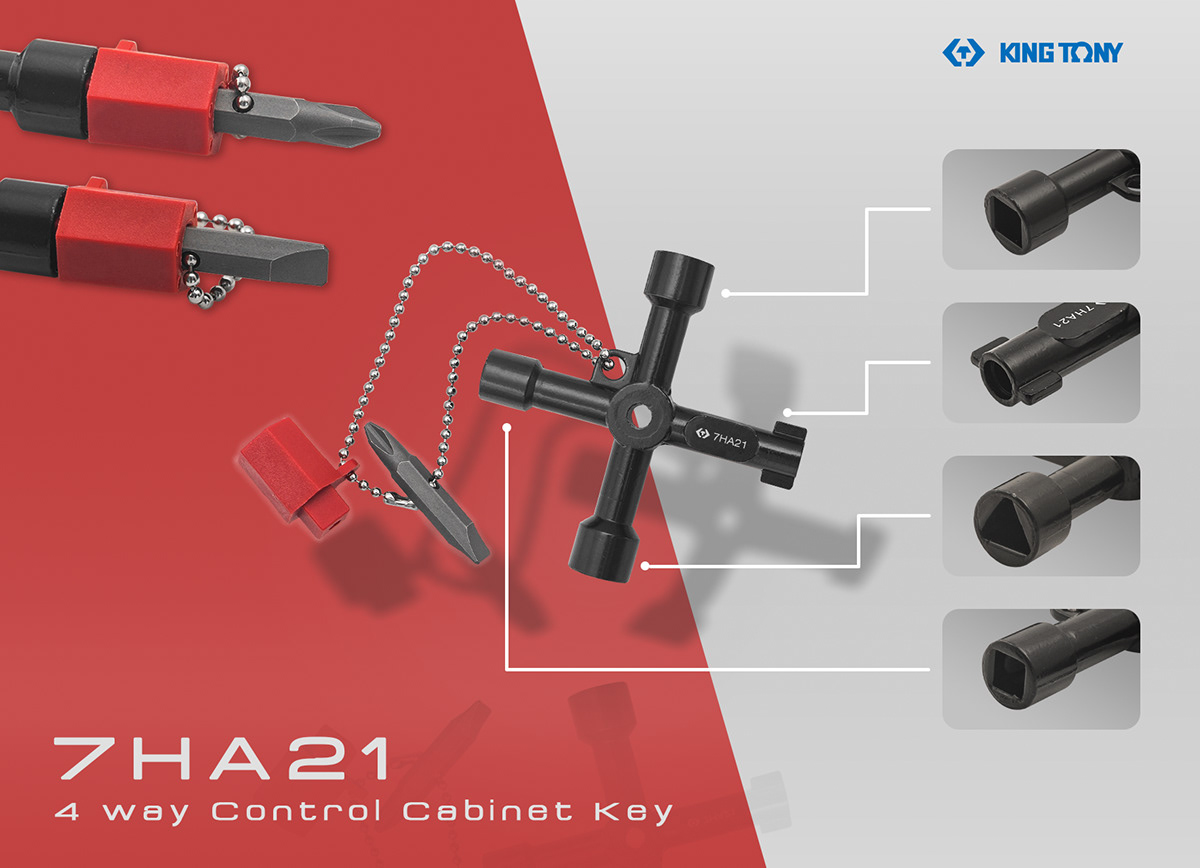
Since the product comes with this red object, I borrowed its red hue and once again used color separation for the background.
A small amount of product info and features are scattered around, giving it an overall simple, clean visual style.
However, the only drawback is that the background colors could maybe switch places to make the red object stand out a bit more.
However, the only drawback is that the background colors could maybe switch places to make the red object stand out a bit more.
由於產品本身附帶了一項紅色物件,所以我借用了它的紅色,並再次透過顏色分割的方式來呈現背景,而少量的產品資訊及特色就分佈在周圍,整體視覺風格很簡單、乾淨。 不過美中不足的是,背景的顏色似乎可以左右對調來讓紅色物件更顯眼一些。
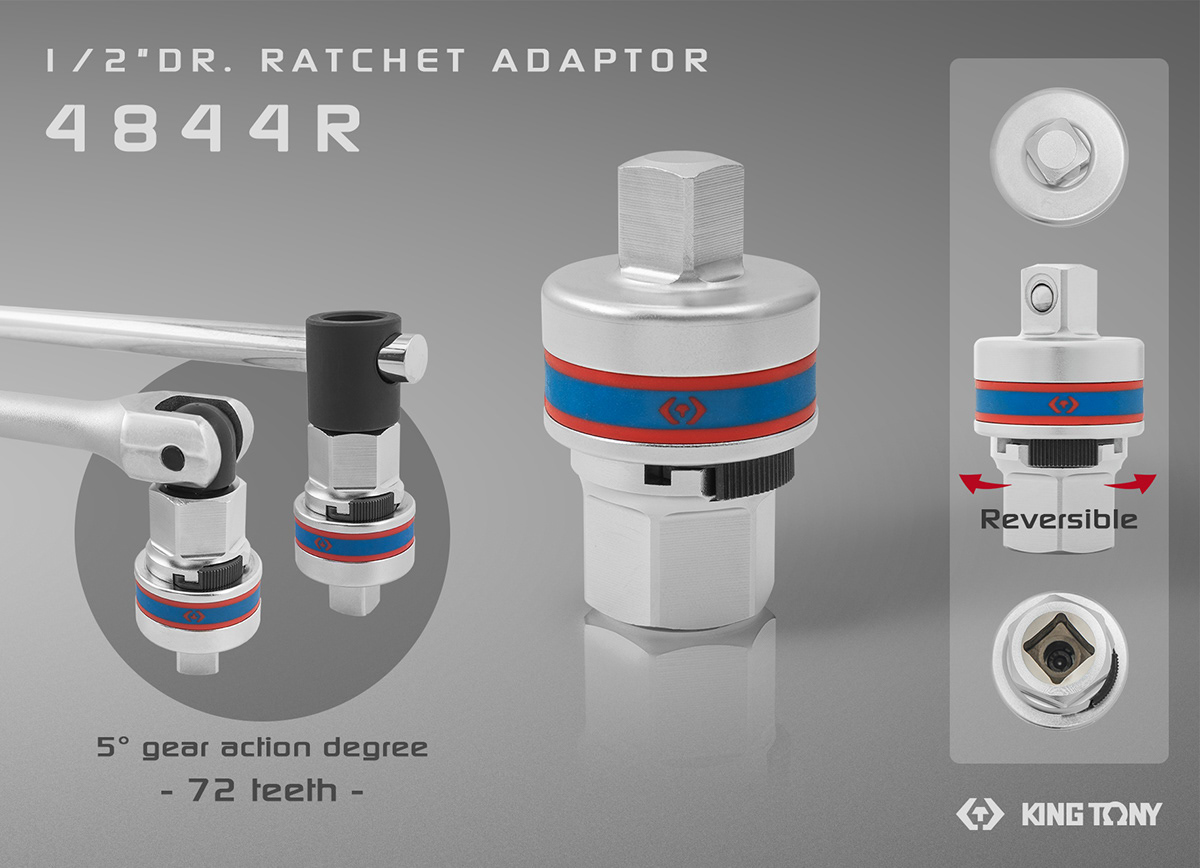
Given the product's concentrated design and structure, I tried to enhance its prominence using shadows, reflections, and a simple background.
The end result surprisingly turned out quite striking.
The rest of the product features are complemented with geometric blocks, ensuring both easy viewing and readability.
由於產品本身的外型及結構很集中,所以我嘗試以陰影、倒影以及單調的背景來強化產品的主體性,最後呈現的效果意外地十分顯著。 而其餘的產品特色皆使用幾何色塊來襯托,觀賞及閱讀的便利性兼具。
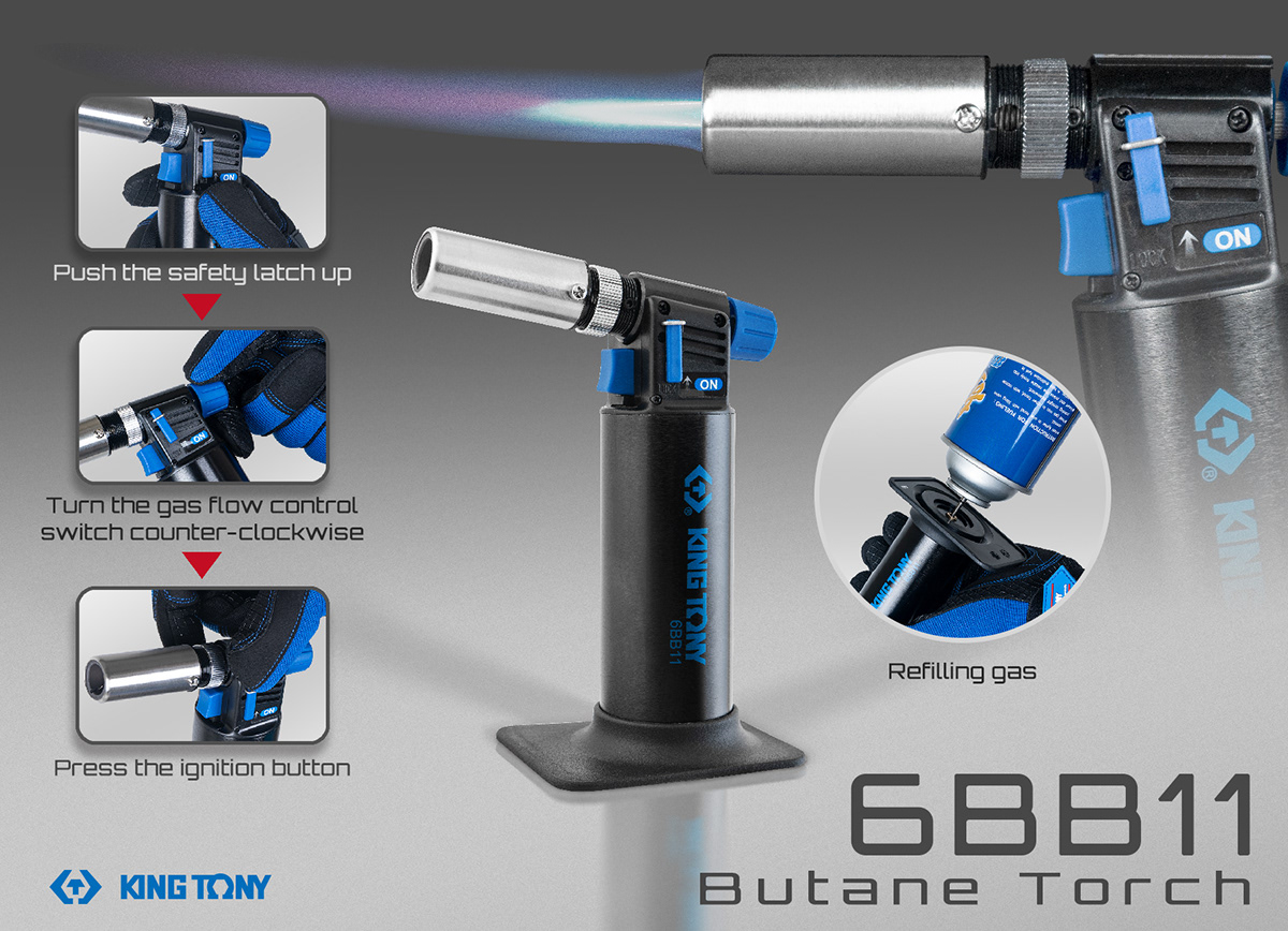
The product has a large area of black, so I used a gradient background in gray, along with product shadows and reflections, to emphasize the product's main features. For visual balance, I enlarged the picture with flame and placed it in the top right corner.
I also used circular borders to prevent an overload of square elements in the composition. As for colors, a touch of blue was added to brighten up the grayscale and give it a bit of life.
產品的外觀有大面積的黑色,所以我使用灰色的漸層背景及俺品陰影、倒影來強化產品的主體性。 為了畫面構圖的平衡性,我將有火焰的產品照放大並擺放於右上角,再透過圓形框線的特色圖來避免畫面中的其他方形元素過於過多。 而顏色方面的配置則以少量的藍色來點亮沒有精神的灰階。


